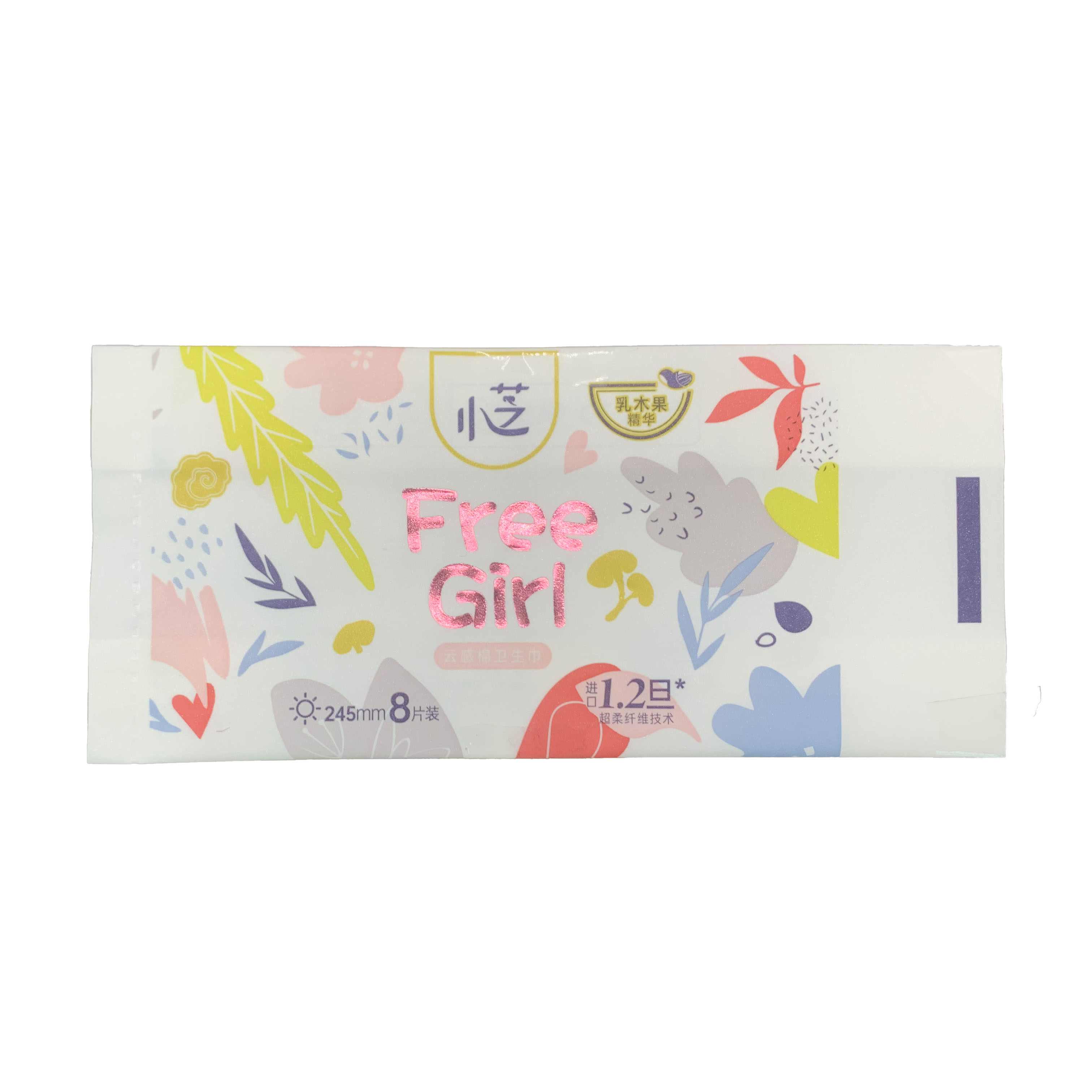
When Kotex approached us to design packaging for its “Luxury Transparent Wing” sanitary pads, we kicked off with in - depth brand immersion. The client aimed to highlight the product’s “240mm”, “9 - piece” specifications, and core selling points like “ultra - thin” and “skin - friendly”. They wanted packaging that fused elegance with a sense of premium care, targeting women who seek both comfort and aesthetic appeal in feminine hygiene products. Key demands included showcasing technological strengths (e.g., “0.09cm ultra - thin”), integrating brand elements (the Kotex logo), and ensuring the design stood out on shelves while conveying trust and sophistication.
We delved into market research, analyzing the feminine hygiene packaging landscape. Trends showed consumers value clarity in product info (absorbency, quantity) and appreciate designs that balance softness (to evoke care) with modernity (to feel up - to - date). Studying competitors, we noticed many relied on bold colors or overly clinical visuals. For Kotex’s target audience – women prioritizing comfort and quality – the design needed to signal “premium protection” through refined aesthetics and clear messaging. We also surveyed user preferences, finding a demand for packaging that feels “gentle” yet “reliable”, avoiding overly floral or childish motifs.
Our team centered the concept on “translucent luxury”. We chose a soft, pastel - hued palette (light pink, mint green) layered over a translucent base, mirroring the product’s “ultra - thin, see - through” feature. For typography, we paired a delicate serif font for “Luxury Transparent Wing” to convey elegance, with clean sans - serif fonts for technical info (e.g., “240mm”, “9 pieces”) to ensure clarity. Gold foil accents were introduced to elevate the premium feel, highlighting key selling points like “0.09cm ultra - thin”.
We opted for a sealed flat pouch with a resealable strip and product window (密封平底袋,带自封条与产品视窗). The flat design is space - efficient for storage, while the resealable strip ensures hygiene post - opening – critical for sanitary products. The product window (a translucent section) lets consumers glimpse the pad, adding tangibility to the “ultra - thin” claim. We also included a tear notch for easy opening, balancing practicality with sophistication.
We chose a PET - PE composite film with translucent layers (聚酯 - 聚乙烯复合膜,含半透明层). PET provides structural integrity for printing (ensuring gold foil and pastels pop), while PE offers flexibility for the resealable strip. The translucent sections use a thinner PE blend, allowing product visibility without compromising protection. This material combo balances aesthetics (vibrant colors, premium finish) with functionality (moisture resistance, sealability).
On the front, “Luxury Transparent Wing” takes center stage in the elegant serif font, surrounded by gold foil to draw attention. The Kotex logo is placed prominently for brand recognition. Technical info (size, quantity) is positioned below in clear sans - serif, ensuring quick comprehension. Gold - accented badges highlight “0.09cm ultra - thin” and “skin - friendly”, turning key features into visual icons. The translucent window is strategically placed to align with the product’s shape, reinforcing the “see - through” benefit.
We presented the draft to Kotex, who praised the elegant aesthetic but wanted to refine the gold foil balance. They felt some accents competed with the brand logo. We adjusted the foil placement, focusing it on product claims (e.g., “ultra - thin”) to avoid clutter. We also tweaked the translucent window size to better frame the pad, enhancing the “visual proof” of thinness. Multiple rounds of feedback honed the design, ensuring every element – from color to typography – amplified the “premium care” message.
Once approved, we prepped the design for production. We specified material thickness (to ensure durability), foil stamping details (for consistent gold accents), and resealable strip mechanics (to guarantee a secure seal). We provided Kotex with detailed files – from die - cut templates for the tear notch to color calibration guides – ensuring the factory replicated our design’s elegance and precision.
In the end, the Kotex “Luxury Transparent Wing” packaging became a case study in blending femininity, functionality, and premium branding. It stands out on shelves, communicates trust through clear specs, and transforms a sanitary product into a symbol of refined care – all while meeting the practical needs of storage, hygiene, and user appeal.


 Tel: +86-18359551931
 Email: nicole@tansoxpack.com
 MP/WhatsApp: +86-18359551931
 Manufacturer Address:No.179,Tangsu Industrial Park,Tangshi Community,Xintang Street,Quanzhou City,Fujian Province CHINA